16 Paint Colors for Living Room That Feel Warm, Stylish, and Timeless
Choosing the right paint color for your living room can completely change how your home feels. It’s the space where you relax, host guests, and spend everyday moments — so the color needs to feel both comfortable and intentional. The right shade can make a small room feel bigger, a dark room feel brighter, or a plain room feel layered and inviting. If you’ve been staring at paint swatches unsure where to start, these ideas will help you choose confidently.
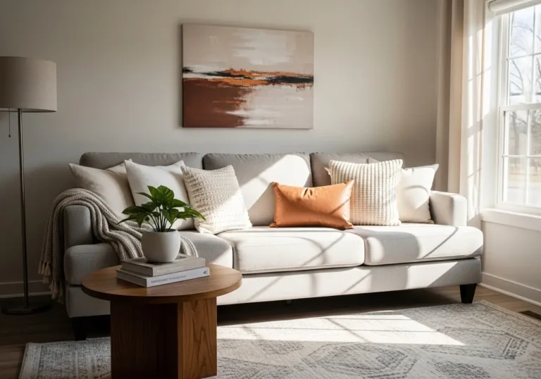
1. Warm White for a Soft, Inviting Base
Warm white isn’t stark or clinical — it has creamy or beige undertones that feel gentle and welcoming. This works because it reflects light beautifully while still adding subtle warmth to the room.
Tip: Look for whites labeled “ivory,” “cream,” or “warm white.” Test it in natural and artificial light.
Mistake to avoid: Choosing a cool, blue-toned white in a north-facing room — it can feel cold and flat.
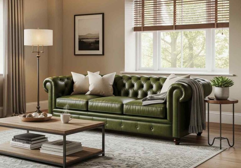
2. Soft Greige for Balanced Warmth
Greige (a mix of gray and beige) is one of the most versatile living room colors. It works because it bridges warm and cool tones, making it easy to pair with wood, metal, or colorful décor.
Example: Pair greige walls with warm wood furniture and textured throws.
Mistake: Picking a greige that leans too purple or too green. Always test samples first.
3. Light Sage Green for Calm Energy
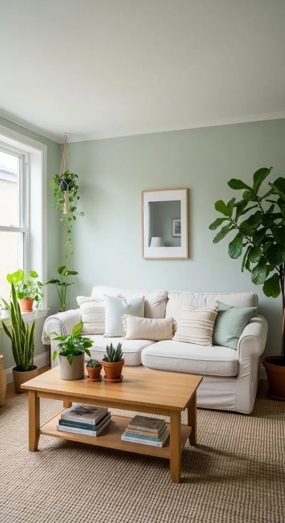
Sage green adds a soft, nature-inspired touch without overpowering the room. This works because green feels restful and grounding, making the space feel peaceful yet fresh.
Tip: Use light sage in rooms with good natural light to enhance its softness.
Avoid: Very dark green in small spaces unless balanced with lighter furniture.
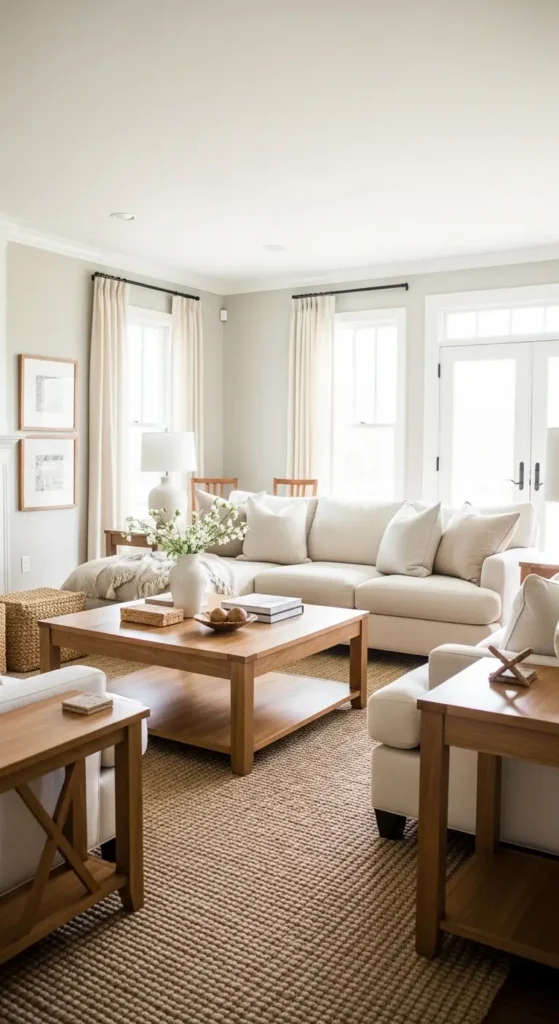
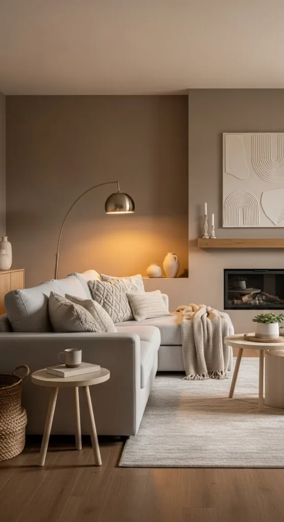
4. Classic Beige for Timeless Comfort
Beige sometimes gets overlooked, but the right shade feels cozy and elegant. It works because it warms up the room without drawing too much attention, allowing furniture and décor to shine.
Example: Beige walls paired with white trim and layered textiles feel effortlessly inviting.
Mistake: Choosing a beige that’s too yellow — it can look dated under certain lighting.
Also Read This Blog: Accent Walls in Living Room: 15 Stylish Ideas That Actually Work
5. Dusty Blue for Subtle Sophistication
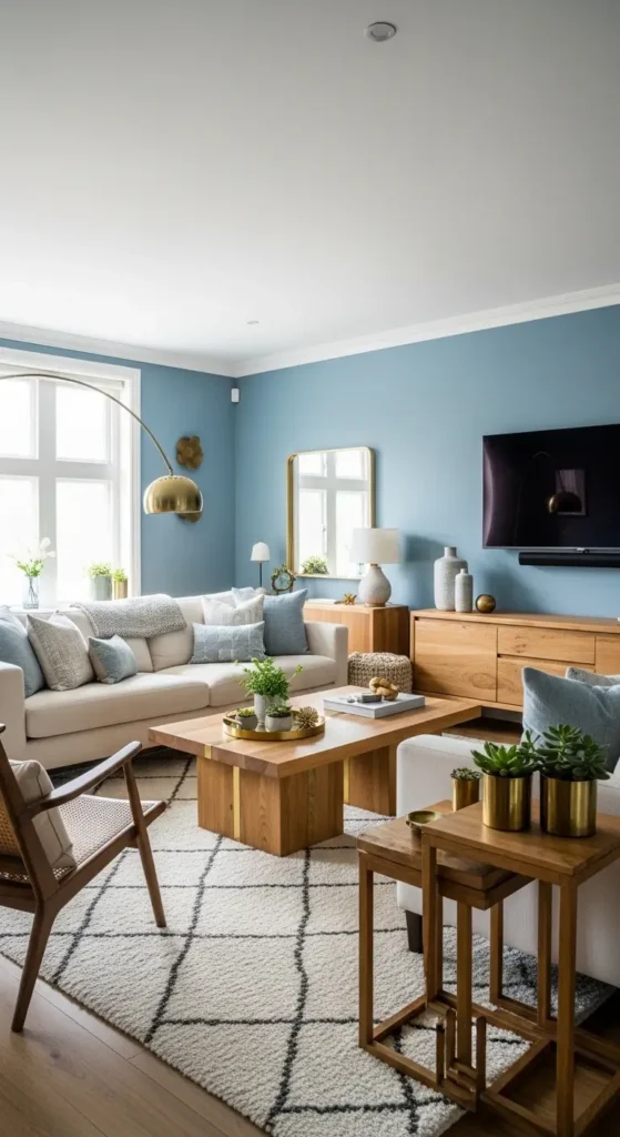
Dusty blue offers color without overwhelming the space. This works because muted blue tones feel calming and refined, especially in well-lit rooms.
Tip: Pair dusty blue walls with cream sofas and natural wood accents.
Avoid: Bright, bold blues unless you’re intentionally creating a dramatic focal point.
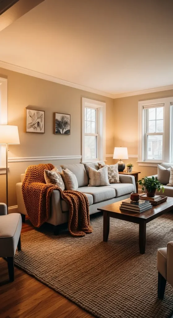
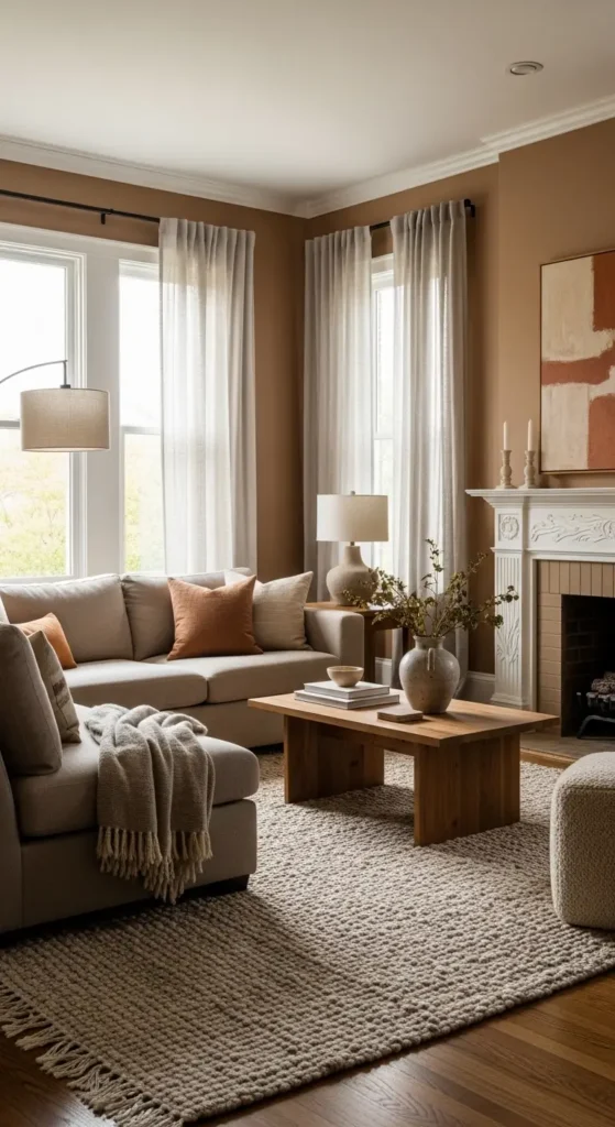
6. Warm Taupe for Depth Without Darkness
Taupe adds depth while staying neutral and livable. It works because it creates subtle contrast with white trim and lighter furniture, giving the room dimension.
Example: Warm taupe behind a light-colored sectional adds quiet richness.
Mistake: Using a cool taupe in a low-light room — it may read as dull gray.
7. Muted Terracotta for Earthy Warmth
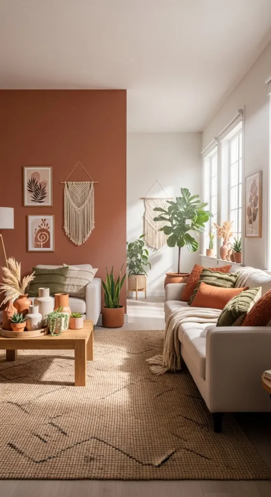
Muted terracotta brings a grounded, earthy feel to a living room. This works because warm clay tones feel cozy and welcoming without being overpowering.
Tip: Use terracotta as an accent wall if you’re unsure about painting the whole room.
Avoid: Very bright orange tones — they can feel intense rather than soothing.
8. Soft Charcoal for Modern Contrast
Soft charcoal adds drama while still feeling refined. It works because darker tones create contrast, especially in rooms with ample natural light.
Example: Charcoal walls with light furniture and warm wood accents look modern yet balanced.
Mistake: Using very dark charcoal in a small room without enough lighting — it can feel heavy.
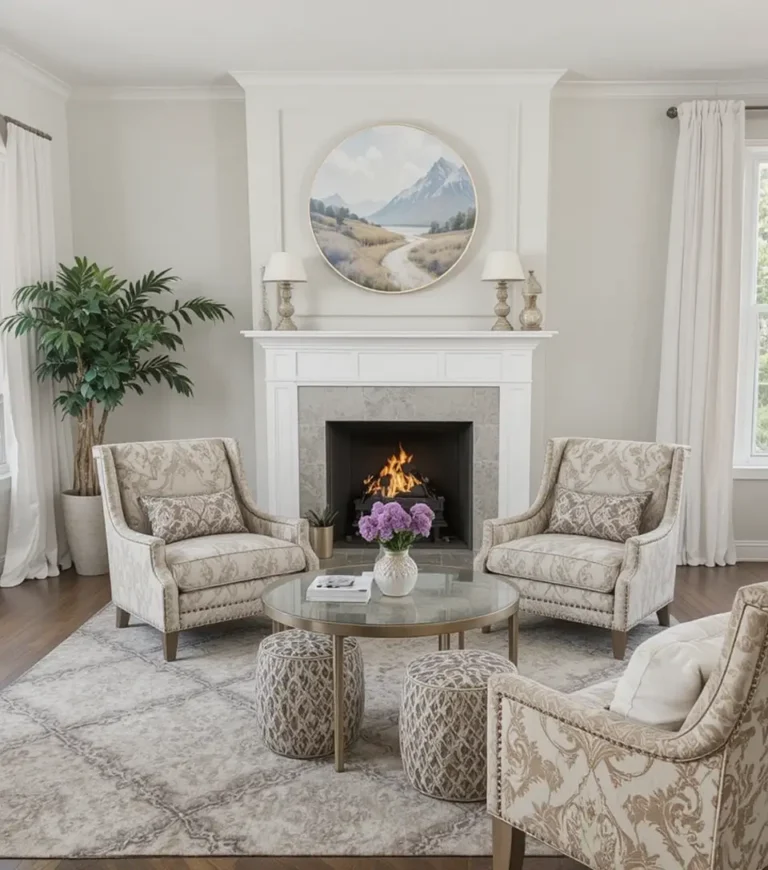
Also Read This Blog: Living Room with Fireplace: 15 Smart Design Ideas
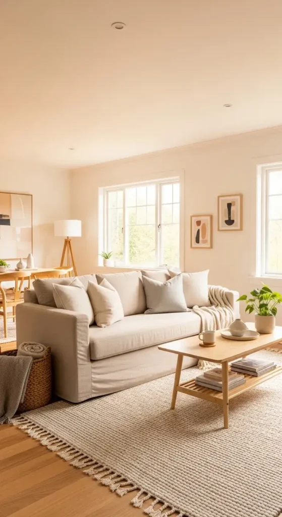
9. Creamy Off-White for Gentle Warmth
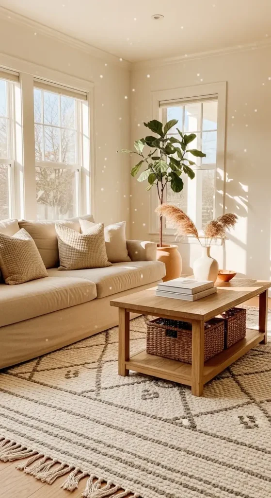
If pure white feels too sharp but beige feels too heavy, creamy off-white is a beautiful middle ground.
This works because it keeps the room bright while adding a soft warmth that flat white sometimes lacks.
Tip: Pair creamy walls with natural wood and woven textures to enhance the cozy effect.
Mistake to avoid: Choosing a cream with strong yellow undertones — it can look outdated under LED lighting.
10. Deep Navy for Bold Elegance
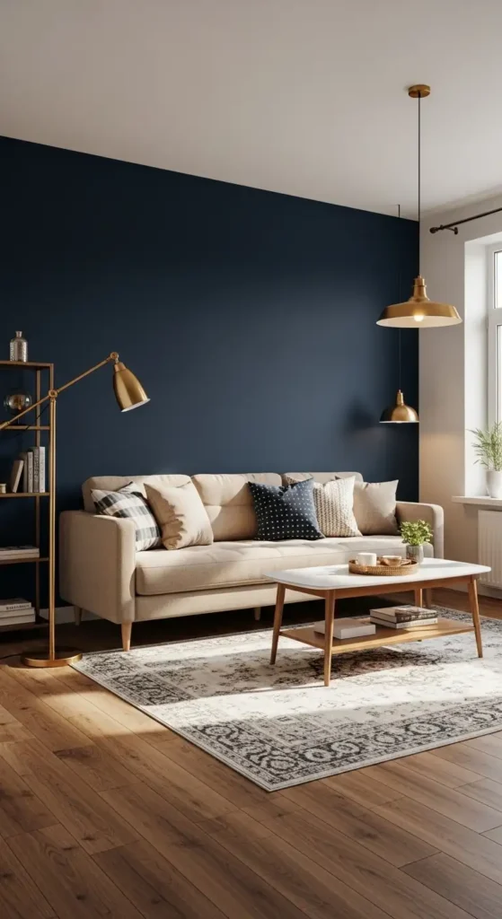
Navy creates a rich, grounded atmosphere without feeling as stark as black. It works because deep blue adds sophistication while still feeling classic and livable.
Example: Use navy on one accent wall behind a sofa, paired with warm brass or wood tones.
Avoid: Painting every wall navy in a small, low-light space — it can feel closed in.
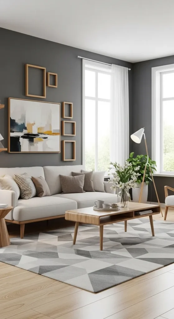
11. Pale Gray for Modern Simplicity
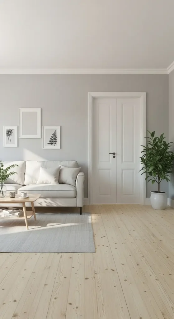
Pale gray offers a clean, contemporary feel that complements almost any décor style. This works because it acts as a quiet backdrop, allowing furniture, artwork, and textiles to stand out.
Tip: Choose a gray with warm undertones if your floors are wood.
Mistake: Cool, blue-gray in dim rooms can feel chilly and uninviting.
Also Read This Blog: 14 Floor Lamps Living Room Ideas for Warmth, Balance, and Better Lighting
12. Warm Mushroom for Subtle Sophistication
Mushroom is a soft blend of beige and gray with earthy undertones. t works because it feels layered and refined without being obvious or trendy.
Example: Mushroom walls paired with linen curtains and a textured rug create effortless depth.
Avoid: Ignoring undertones — test the color next to your flooring before committing.
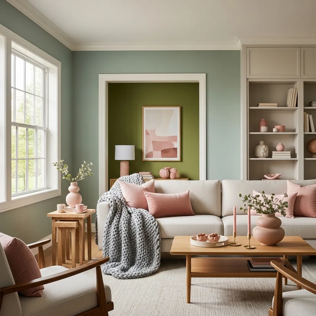
13. Soft Blush for Unexpected Warmth
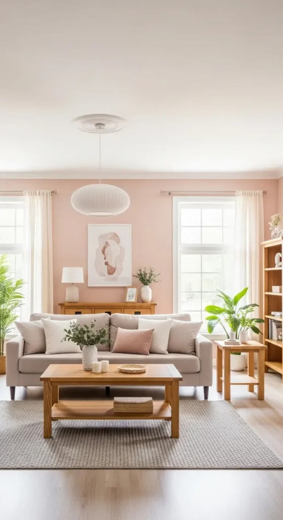
Soft blush can be surprisingly neutral when muted and balanced properly. This works because blush adds warmth and personality without overwhelming the space.
Tip: Keep the shade subtle and pair it with natural textures like oak or rattan.
Mistake: Choosing bright pink instead of a dusty blush — the room should feel calm, not loud.
14. Olive Green for Earthy Depth
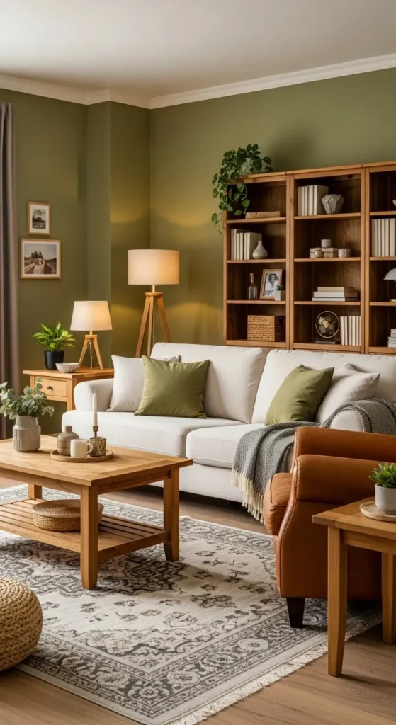
Olive green brings richness and a grounded, natural feeling to a living room. This works because green connects to nature and pairs beautifully with wood and leather.
Example: Olive walls with cream sofas and warm lighting create a cozy retreat.
Avoid: Very dark olive in small rooms without good lighting — it may absorb too much light.
Also Read This Blog: 16 Accent Chairs for Living Room: 16 Ideas to Add Style and Function
15. Soft Peach for Gentle Energy
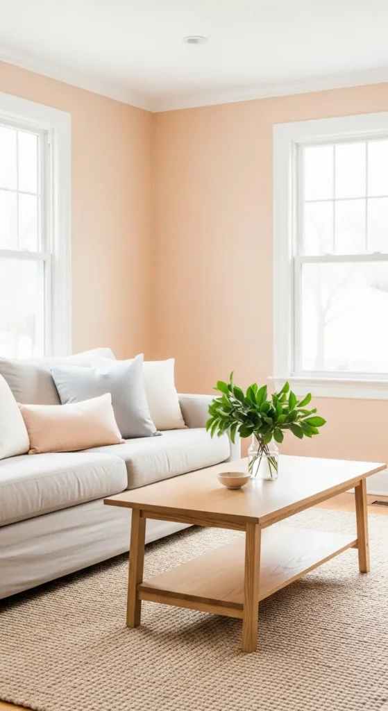
Soft peach adds warmth without the intensity of orange. It works because it reflects light in a flattering way, making the room feel welcoming and cheerful.
Tip: Use a muted peach with white trim to keep it fresh and balanced.
Mistake: Choosing a saturated coral tone — it can dominate the room quickly.
16. Moody Teal for Dramatic Comfort
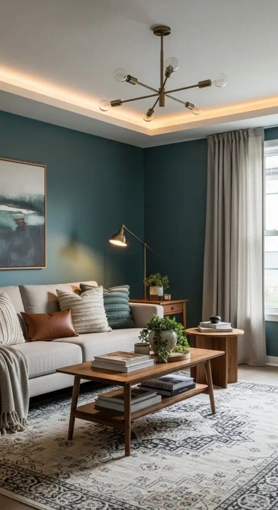
Moody teal combines the calm of blue with the richness of green. This works because it adds personality while still feeling cozy and grounded.
Example: Teal walls paired with warm wood, beige textiles, and layered lighting feel intimate yet elegant.
Avoid: Using high-gloss finishes — darker colors look more refined in matte or eggshell finishes.
FAQ,S
1. What is the best paint color for a small living room?
Light warm neutrals like creamy white or soft greige help small living rooms feel bigger and brighter.
2. Should living room paint be warm or cool?
Warm tones usually feel more inviting and comfortable, especially in spaces used for relaxing.
3. How do I test paint colors before committing?
Paint large sample swatches on different walls and observe them in both daylight and evening light.
4. Are dark paint colors good for living rooms?
Yes, if the room has good lighting and lighter furniture to balance the depth.
5. What paint finish works best for living rooms?
Eggshell or satin finishes are ideal because they’re durable while still looking soft and elegant.
Conclusion
Choosing the right paint color for your living room isn’t about trends — it’s about how you want the space to feel. Light shades can make a room open and airy, while deeper tones create intimacy and depth. The key is understanding undertones, testing samples in your lighting, and balancing color with texture and furniture.
Trust your eye, take your time with samples, and remember that paint is one of the easiest ways to transform a room. With thoughtful choices, your living room can feel both stylish and completely personal.