18 Wabi Sabi Painting for Interior Ideas That Feel Calm and Beautiful
Have you ever looked at your walls and felt they were too perfect… and somehow still empty? Clean lines, matching décor, and flawless finishes can sometimes feel cold and lifeless. That’s where wabi sabi comes in. In this guide, we’ll explore wabi sabi painting for interior spaces that embrace imperfection, softness, and natural beauty—helping you create a home that feels calm, grounded, and deeply personal without trying too hard or feeling overly styled or forced at all.
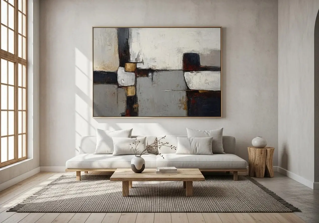
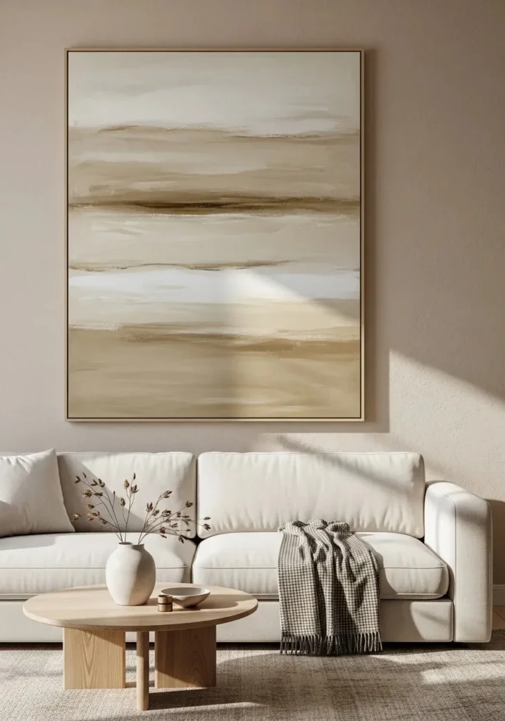
1. Soft Neutral Abstract Brush Strokes
Soft, flowing brush strokes in beige, taupe, and off-white create a calm and understated look. These paintings feel effortless, like they were created in a quiet moment rather than carefully planned.
This works because neutral tones blend seamlessly with most interiors while adding subtle texture and movement. It creates a peaceful atmosphere without overwhelming the room.
Tip: Pair with linen curtains or light wood furniture to enhance the soft, natural feel.
2. Earthy Clay-Toned Canvas Art
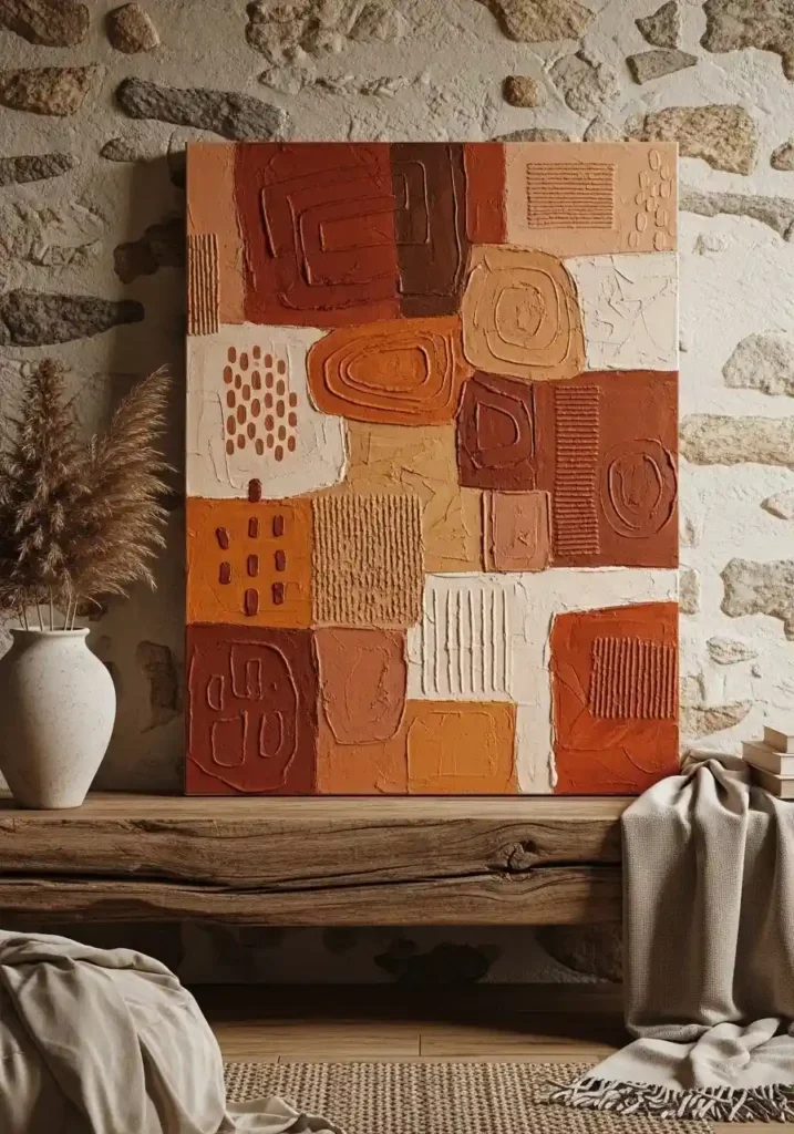
Think warm terracotta, clay, and muted rust tones layered onto a textured canvas. These colors feel grounded and organic, bringing warmth into your space.
This works because earthy tones connect your interior to nature, making the room feel cozy and lived-in. The imperfect blending of colors adds depth and authenticity.
Tip: Use slightly uneven frames or raw canvas edges to stay true to the wabi sabi aesthetic.
3. Minimal Ink Wash Paintings
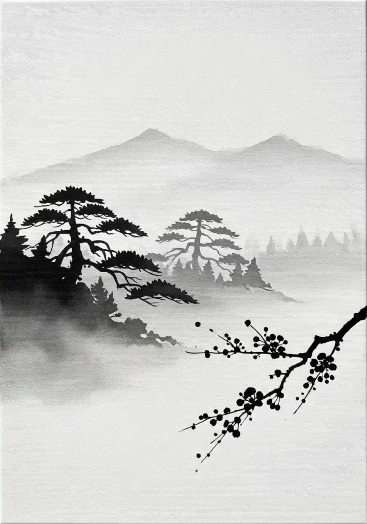
Simple black ink wash paintings with soft gradients and organic shapes reflect a quiet, meditative style. They often feature abstract forms or nature-inspired lines. This works because the contrast between black and white creates visual interest while still feeling minimal and calm.
Tip: Hang in a space with plenty of natural light to highlight the delicate brushwork.
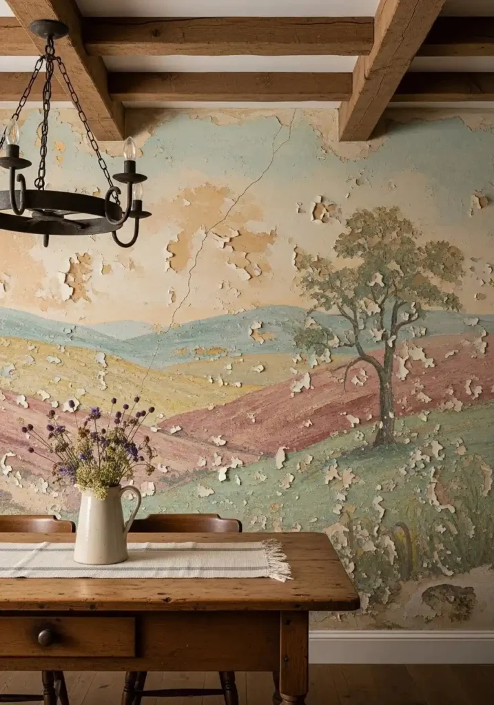
4. Textured Plaster Wall Art
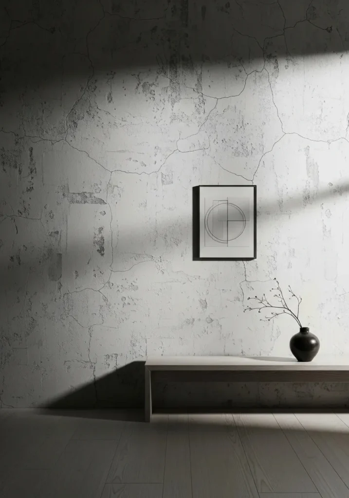
Plaster-style paintings with visible texture, cracks, and uneven finishes create a raw, tactile look. These pieces often use soft whites, greys, or sand tones. This works because texture adds depth and makes the wall feel alive, even with a simple color palette.
Tip: Use side lighting or wall sconces to highlight the texture and shadows.
5. Wabi Sabi Painting for Interior with Faded Landscapes
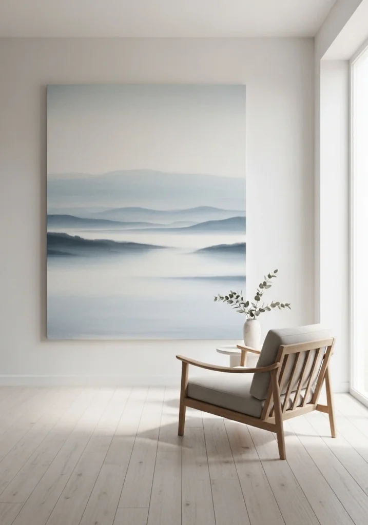
Soft, faded landscapes—like misty hills or abstract horizons—bring a sense of calm and distance into your home. This works because the blurred edges and muted colors create a dream-like quality, making the space feel open and serene.
Tip: Choose oversized pieces to make a gentle statement without adding clutter.
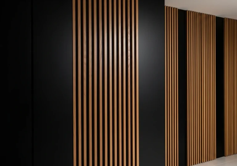
Also Read More: Black Wall with Wood Slats: 16 Bold & Beautiful Ways to Style It
6. Raw Canvas with Imperfect Edges
Unfinished canvas with frayed edges or visible brush marks adds an authentic, handmade feel. The beauty lies in its imperfection. This works because it removes the pressure of perfection, making your space feel more relaxed and personal.
Tip: Skip heavy frames and let the canvas hang freely for a more natural look.
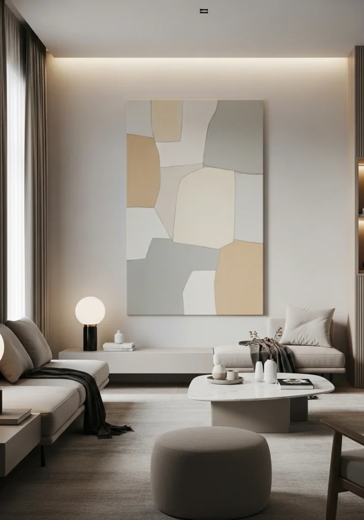
7. Monochrome Beige Layered Art
Layer different shades of beige, cream, and sand to create depth without strong contrast. The result is soft, subtle, and calming. This works because tonal variation keeps the artwork interesting while maintaining a cohesive and quiet palette.
Tip: Place against a slightly darker wall to help the layers stand out gently.
8. Abstract Nature-Inspired Forms
Paintings inspired by stones, water, clouds, or wind patterns bring organic shapes into your home. These designs feel fluid and unstructured. This works because nature-inspired forms are naturally calming and timeless, helping your space feel grounded.
Tip: Combine with indoor plants to strengthen the connection to nature.
Also Read More: 13 Shoe Storage Ideas for Small Spaces That Actually Work
9. Worn and Weathered Paint Finishes
Artwork that looks aged, chipped, or weathered adds character and history to your walls. Think peeling textures and faded pigments. This works because it tells a story and creates a sense of depth that brand-new pieces often lack.
Tip: Pair with vintage or rustic furniture to enhance the aged aesthetic.
10. Soft Gray Wash Minimal Art
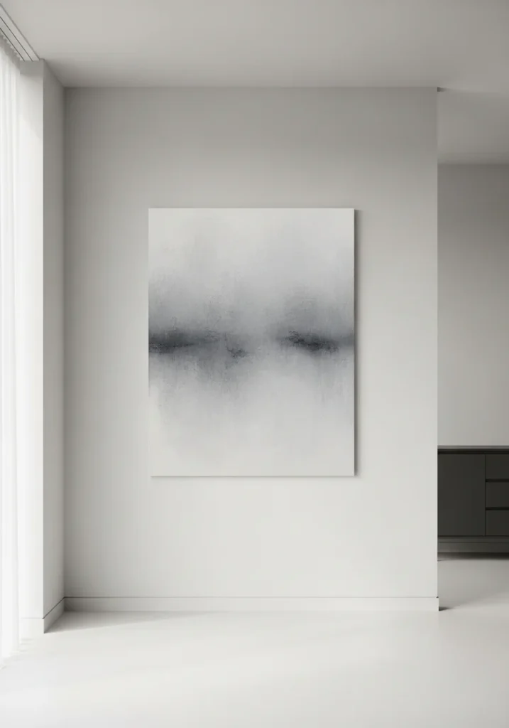
Soft gray wash paintings create a gentle, calming presence in your dining or living space. These pieces often feature diluted paint spread unevenly across the canvas, creating a misty, almost fog-like effect.
This works because gray tones feel neutral yet sophisticated, blending easily with wood, stone, and linen textures. The uneven wash adds movement without overwhelming the eye.
Tip: Pair gray artwork with warm lighting to prevent the space from feeling too cool or flat.
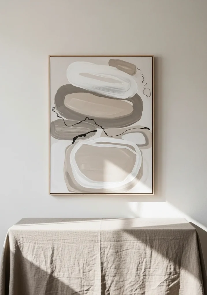
11. Organic Line Art on Textured Backgrounds
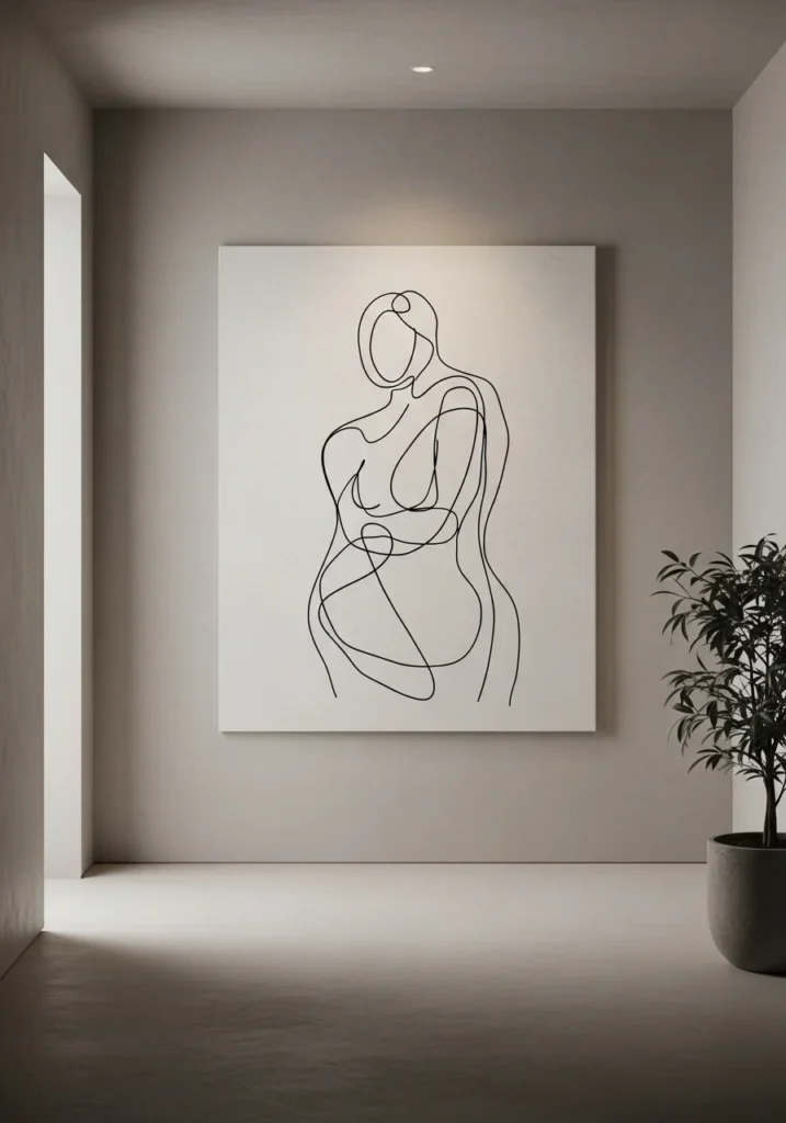
Simple, imperfect line drawings layered over textured backgrounds bring a quiet elegance to your walls. Think hand-drawn curves or abstract figures on a rough, neutral canvas.
This works because the contrast between clean lines and imperfect textures creates balance. It feels artistic without being too bold or distracting.
Tip: Choose thin, subtle frames or frameless designs to keep the focus on the artwork itself.
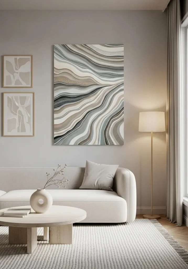
12. Muted Blue and Stone Color Blends
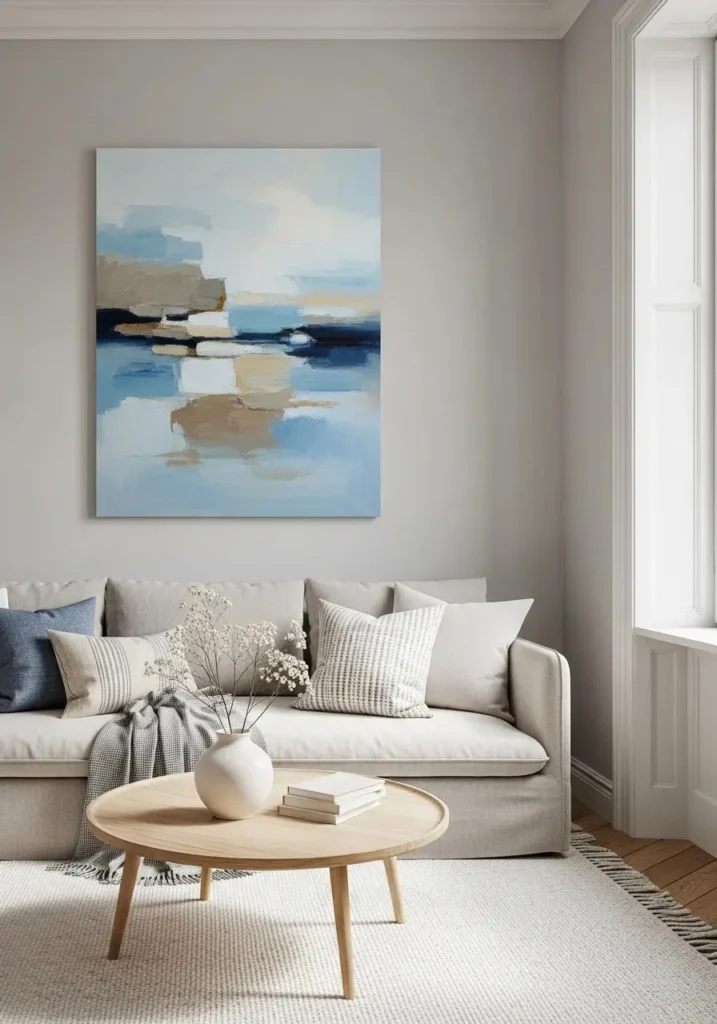
Soft blues mixed with stone, gray, and sand tones create a peaceful and airy atmosphere. These paintings often resemble skies, water, or distant horizons.
This works because cool tones calm the mind while the muted palette keeps everything grounded. It’s perfect for creating a relaxed, serene environment.
Tip: Place near natural light sources to enhance the soft color transitions.
Also Read More: 16 Clothes Storage Ideas for Small Spaces That Actually Work
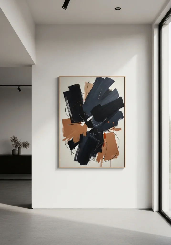
13. Asymmetrical Abstract Composition
Wabi sabi embraces imbalance, and asymmetrical artwork reflects that beautifully. Paintings with off-center elements or uneven shapes feel natural and unforced.
This works because the human eye finds interest in imperfection. It breaks the rigidity of traditional layouts and adds quiet creativity to your space.
Tip: Hang slightly off-center or pair with uneven décor for a more organic look.
14. Sand Texture Minimal Paintings
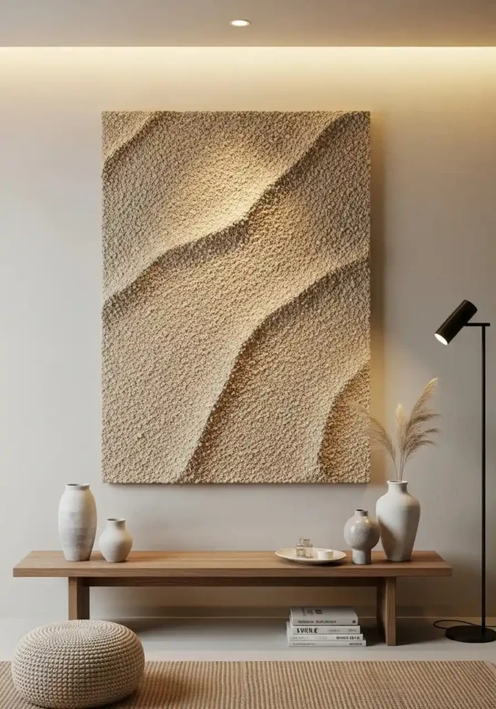
Artworks that mimic sand textures or grainy finishes bring a tactile, earthy quality to your walls. These often use soft beige, ivory, and warm neutrals.
This works because texture adds depth even when colors are minimal. It creates a soothing, grounded environment that feels close to nature.
Tip: Use soft, directional lighting to highlight the texture and subtle shadows.
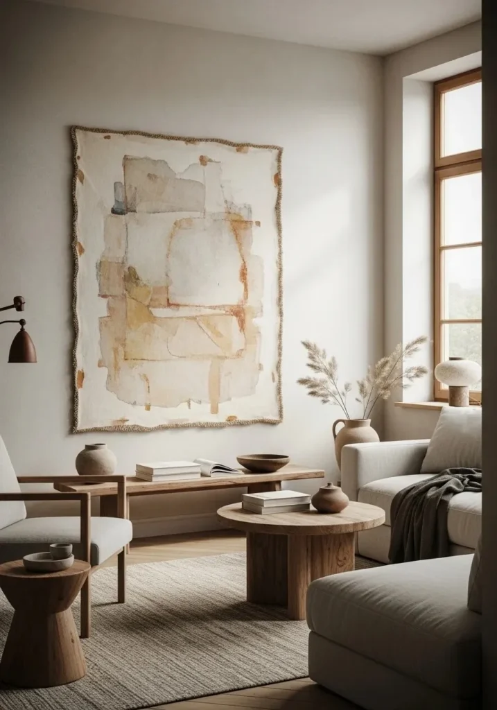
15. Wabi Sabi Painting for Interior with Broken Color Layers
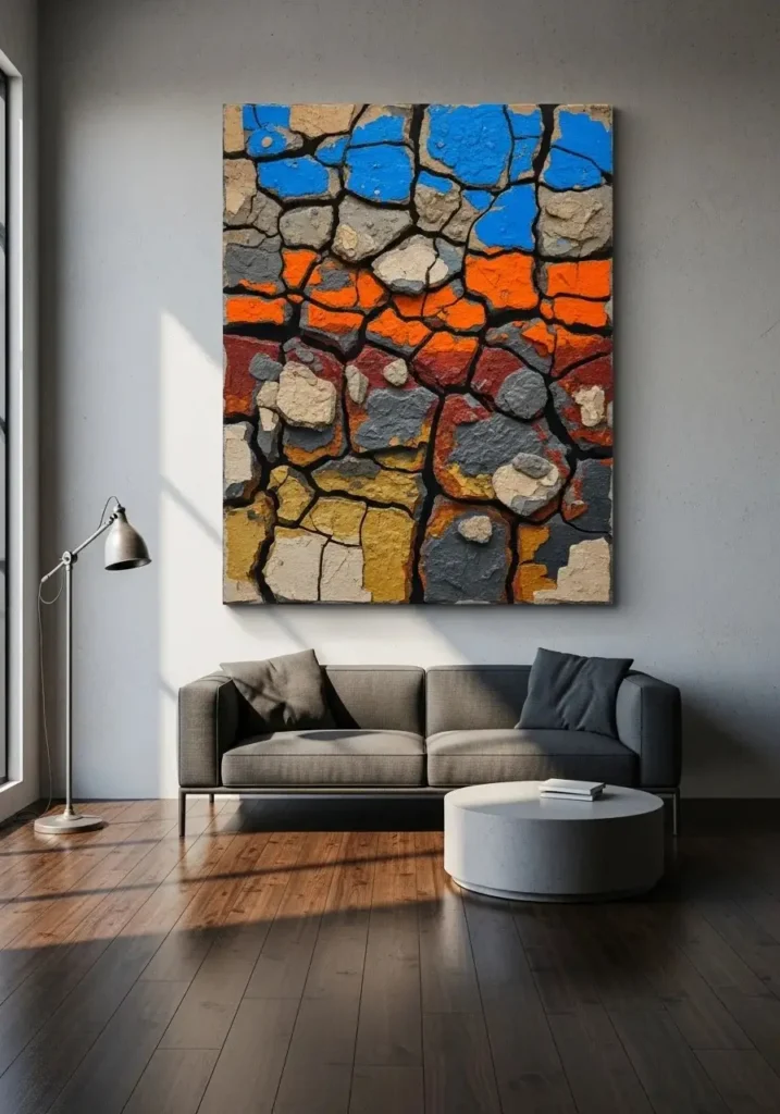
Layered paintings with visible breaks, cracks, or uneven patches of color reflect the essence of imperfection. These pieces often feel raw and unfinished. This works because it celebrates flaws as part of the design, making your space feel authentic and lived-in rather than staged.
Tip: Avoid over-decorating around it—let the artwork stand out naturally.
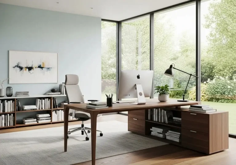
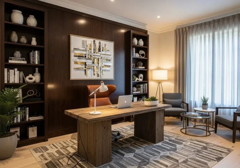
Also Read More: 12 Home Office Design Ideas to Create a Productive and Stylish Workspace
16. Earth and Charcoal Contrast Art
Combining deep charcoal tones with soft earth colors creates a striking yet balanced look. The dark elements add depth, while the lighter tones keep it grounded. This works because contrast draws the eye without feeling harsh when paired with natural hues. It adds quiet drama to minimal interiors.
Tip: Place against a light wall to enhance the contrast and visual impact.
17. Minimal Botanical Brush Art
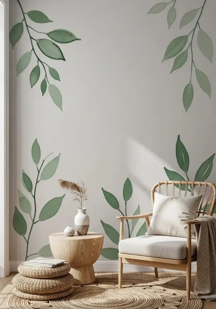
Loose, imperfect brush paintings of leaves, branches, or simple botanical shapes bring nature indoors in a subtle way. These are often done in muted greens or soft browns. This works because organic forms feel calming and familiar, helping your space feel more connected to the natural world.
Tip: Pair with real plants to create a layered, harmonious look.
18. Barely-There White-on-White Art
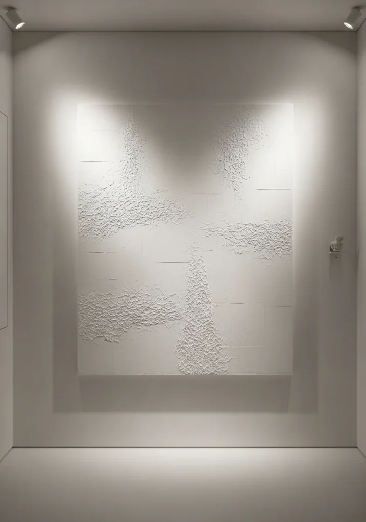
White-on-white paintings use subtle texture and tonal variation instead of color to create interest. These pieces are quiet, soft, and almost invisible at first glance. This works because it adds depth without visual noise, making your space feel open, light, and peaceful.
Tip: Position near natural or angled lighting to reveal the delicate textures.
Conclusion
Designing your home with wabi sabi isn’t about perfection—it’s about feeling. These wabi sabi painting for interior ideas show how simple, imperfect artwork can transform your space into something calm, meaningful, and deeply personal. From soft neutrals and earthy textures to asymmetrical forms and faded layers, each piece tells a quiet story.
Start small with one painting that resonates with you, then slowly build your space around it. Let go of the need for everything to match perfectly. Instead, focus on how your home feels—warm, relaxed, and authentic. When your walls reflect natural beauty and imperfection, your entire space begins to feel more peaceful and truly yours.